Extending Vendure Dashboard Pages: Custom Components for Product & Order Views
We will create a simple widget as a page block that will be displayed on the product detail page.
A Page Block is a modular UI component that can be added to specific pages in the Vendure Admin Dashboard to display custom information or functionality.
This component is ideal for adding supplementary information, custom actions, or integrations with third-party systems directly into relevant dashboard pages.
Prerequisites
- A working Vendure project, installed through
npx @vendure/create my-shop - The Admin Dashboard installed, refer to the installation guide
Step 1: Create a New Plugin
First, we will use the Vendure CLI to scaffold a new plugin. This provides the basic file structure for our extension.
Open your terminal in the root directory of your Vendure project.
Run the following command:
This will use the non-interactive mode for the Vendure CLI tool to scaffold a new plugin.
Ready to build? The Vendure docs cover architecture, setup, and extension from day one.
Read the docsStep 2: Configure the Dashboard Extension Point
To make Vendure aware of our new dashboard component, we need to tell the plugin where to find its entry file.
Open the main plugin file located at ./src/plugins/product-widget/product-widget.plugin.ts.
In the @VendurePlugin decorator, add the dashboard property. This property specifies the path to the entry file for our UI extension.
Tip: The path is relative to the plugin's root directory (
src/plugins/product-widget/).
Step 3: Create the Custom Component
Now, let's create the React component for our widget. By keeping the component in its own file, we keep our code organized.
Create a new directory named dashboard inside your plugin directory (./src/plugins/product-widget/).
Inside the new dashboard directory, create a file named product-info-widget.component.tsx.
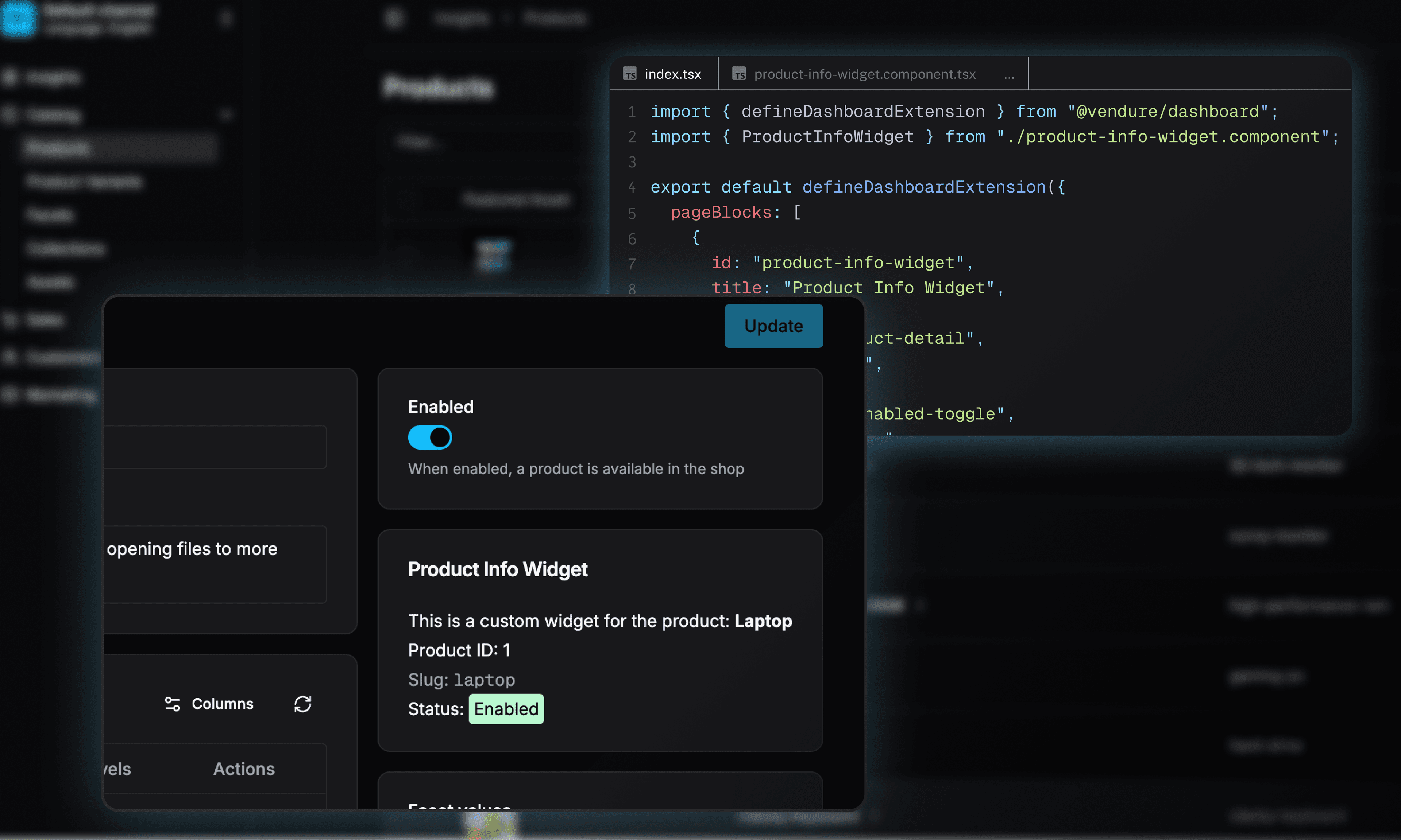
Add the following code to this file. This component will display the name and ID of the current product.
PageContextValueprovides context about the current page, including the entity being viewed (e.g., a product or order).
Headless commerce for B2B complexity, D2C flexibility, and one backend to run both.
Explore the platformStep 4: Finding Block IDs with Dev Mode
To position your block correctly, you need to know the pageId of the target page and the blockId of an existing block on that page. You can find these by using the built-in Dev Mode.
- In the Vendure Admin Dashboard, click on your user avatar in the bottom-left corner.
- From the dropdown menu, select Enable Dev Mode.
- Navigate to the page you want to extend (e.g., go to Catalog > Products and click on a product).
- Now, when you hover over different sections (blocks) of the page, an overlay will appear, showing you the
pageIdandblockId. Use these values in your location configuration.
Note: The block ID: enabled-toggle is found on the top right of the product page by default. Use Dev Mode to confirm the exact block IDs for your Vendure version.
Step 5: Register the Page Block
With the component created, we now need to register it as a page block in our extension's entry file.
In the same dashboard directory, create a file named index.tsx.
Add the following code to this file. We will import our new component and use the defineDashboardExtension function to tell Vendure where to place it.
All block- and page-IDs can be found using the dev-mode, explained in step 5.
Worth reading, once a month
Product updates, customer stories, and engineering thinking, delivered monthly.
Step 6: Verify the Page Block
Now that everything is configured, let's see our new widget in action.
- If your Vendure development server is running, stop it and restart it to ensure the new plugin and UI code are compiled.
- Open your browser and navigate to the Vendure Admin Dashboard.
- Go to Catalog > Products and click on any product to open its detail page.
- Look in the right-hand sidebar. You should see your new "Product Info Widget" displayed after the "Enabled" toggle block.

And that concludes our discussion. This is a basic custom component presented as a page block, and the Vendure Dashboard offers numerous additional possibilities.
We encourage you to read through our documentation to discover more on what's possible.
Further Reading
Share this guide